


Hardware Finishes: Colour and Where to Specify It
Most hardware lives in a narrow palette of brass, nickel, black, and white. That restraint is part of why hardware works — it lets the rest of a space be the loud thing. But occasionally a project benefits from the opposite: a single point of unapologetic colour, or a full system specified in a particular tone. This guide is about doing both well — where colour belongs in a hardware-forward interior, and which Casson collections are worth knowing about when you want one.
Where does colourful hardware actually work?
In one place at a time. The fastest way to make a space feel cluttered is to scatter colour across every fitting in a room. The fastest way to make it feel intentional is to choose one surface — one wall, one cabinet, one fixture — and let it be the colourful one, with everything around it staying neutral.
This is partly why colour reads so well on hardware specifically. A bright pendant in a kitchen of brass pulls and white cabinetry has impact precisely because nothing else is competing. A single coloured hook by an entryway, framed by quiet walls, becomes a small piece of jewellery. The neutral context is what lets the colour do its work.
Commercial work is the exception. Hospitals, schools, hospitality projects, and public washrooms often specify colour as a system rather than an accent — every fitting in a coordinated colourway, often tied to a brand palette. The discipline is different there, but the same principle holds: the colour has to feel deliberate, not decorative.
Which rooms are best for a single colourful piece?
Three rooms reward it more than the rest. Entryways set the tone for the whole house, and a single coloured hook, light, or door knocker on the way in does that job efficiently. Bathrooms and powder rooms are small enough that one colourful piece can shift the mood of the room without overwhelming it. Children's rooms and play spaces are the obvious case, where joy is part of the brief.
Outside those three, colour is more selective work. It can land beautifully in a kitchen, but only when the kitchen is otherwise restrained. It rarely belongs in a primary bedroom or formal living room, where the calmer the surfaces, the more the room feels like itself.
How do I balance colourful hardware with neutral finishes?
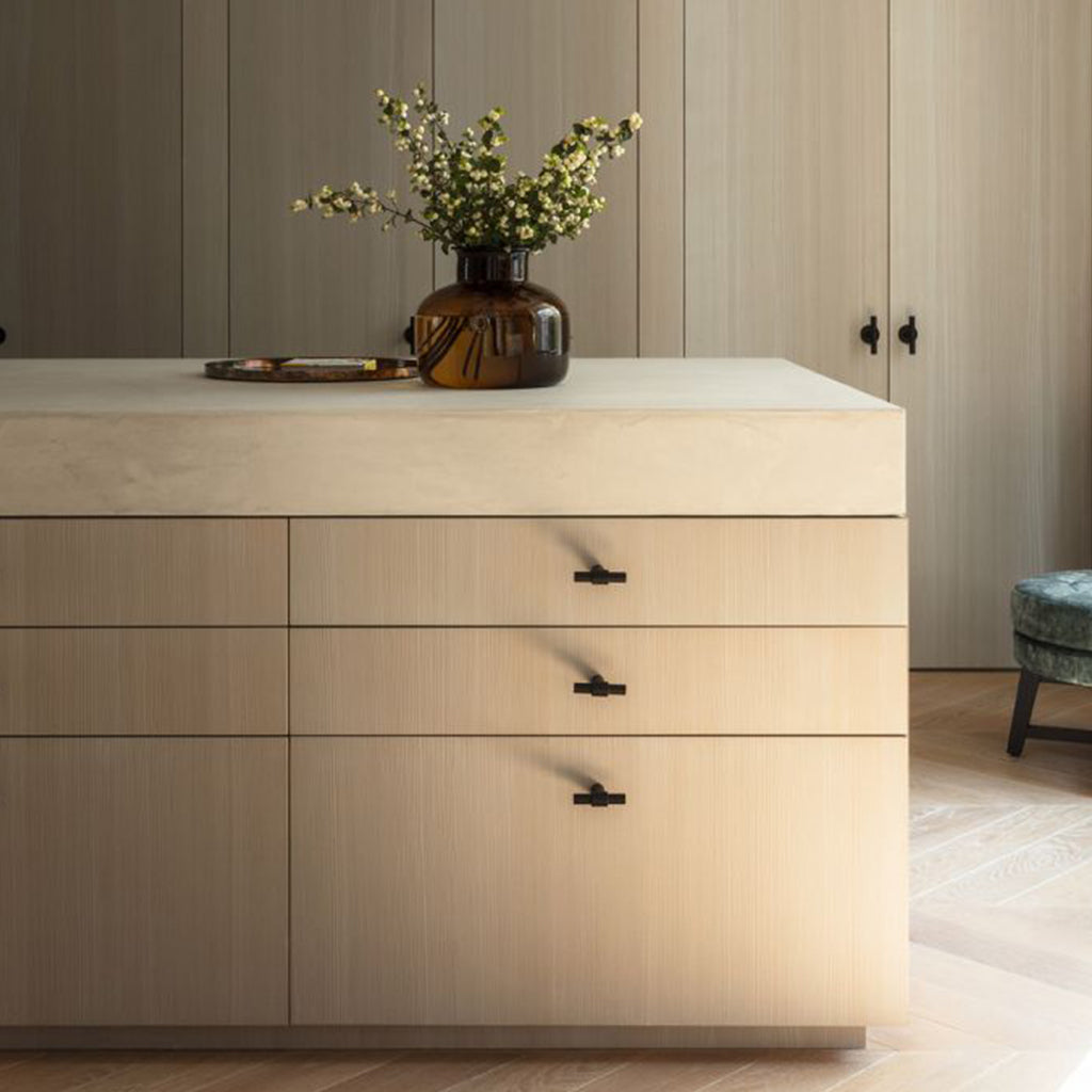
Anchor with neutrals first, then place colour as the accent. The 80/20 rule is a useful starting point: roughly 80% of the visible hardware in a room stays in restrained finishes — brushed brass, matte black, satin nickel — and 20% is the coloured piece doing the lift. Beyond that ratio, colour stops feeling like a deliberate choice and starts feeling like a theme.
Pick colour temperatures that play with the space's existing tones rather than against them. A warm-leaning kitchen with brass hardware tolerates yellows, reds, terracotta, and warm greens; a cool-leaning bathroom with chrome tolerates blues, cool greens, and lilacs. Mixing across temperature is harder — a cool blue against warm brass can read as a fight rather than a contrast.
Standard-line pieces with built-in colour
The pieces below come in colour as standard — no custom order, no waiting on a paint match. Each works as the single colourful element in a room without overwhelming it.
Cherry Pendant — Esaila
Sculptural and modular. Wood cylinders containing magnets bundle into clusters, hung as one cherry-coloured pendant or grouped to form a cascading arrangement. Bright red is the standout colour, but the form also comes in green, grey, black, and natural for projects where the shape is the draw rather than the colour. Best in entryways, dining areas, or stairwells where a hanging gesture has room to breathe.
View the Cherry Pendant
Branch Rubber Hooks — Sugatsune
Small, soft, brightly coloured rubber wall hooks designed by the Japanese hardware studio Sugatsune. Available in a playful range of colours, these are the easiest way to introduce a single point of colour into an entryway, mudroom, or kid's room. Used in a row, they read as deliberate; used singly, they read as a small piece of fun.
View the Branch Hooks
Fossil Hooks — Schneid
Asymmetrical, glazed ceramic hooks that read as small sculptures. Each of the five shapes — Coral (lime), Serpent (cerulean blue), Octo (plum), Pebble (cherry red), Sea Bone (sherbet) — is hand-glazed and hand-finished in Portugal, with irregular surface variation that emphasizes the organic forms. Available individually or as a five-piece set, they suit gallery walls, children's rooms, and entryways where wall objects are part of the design rather than purely functional.
View the Fossil Hooks
Strap Pull — Chapman & Bose
Handcrafted leather strap pulls, made in Ontario, available in olive, red, blue, white, and grey. Where Chapman & Bose's broader leather hardware tends toward traditional saddle tones, the colour range on the Strap Pull is what makes it useful when you want the warmth of leather but the lift of a tinted finish. Best on cabinetry, vanity drawers, and built-ins where a soft tactile pull is more appropriate than metal.
View the Strap Pull
Misto Mirror — Umbra
A frameless oval mirror with a graduated rose-copper tint that fades from clear glass at the top to copper at the base. Less assertive than a fully coloured piece, but distinctly not neutral — useful when you want a tinted accent without committing to a single saturated tone. Particularly well-suited to powder rooms, dressing areas, and entry walls.
View the Misto Mirror
Colour as a full system: HEWI Series 477
For projects that want colour as a system rather than an accent, HEWI's Series 477 — a German-designed line of polyamide bathware and grab rails — comes in over twenty named colours across glossy and matte palettes. The glossy range includes saturated tones (Coral, Ruby Red, Orange, Mustard Yellow, Apple Green, May Green, Aqua Blue, Steel Blue) alongside neutrals (Pure White, Signal White, Light Grey, Stone Grey, Anthracite Grey, Jet Black, Sand, Umber). The matte range stays in five neutrals: Pure White, Signal White, Light Grey, Stone Grey, Anthracite Grey.
The series is designed for accessible washrooms, healthcare environments, and public spaces — places where coordinated bathware (hooks, shelves, grab rails, toilet brush units, soap dispensers) reads as one continuous system. It also works in residential bathrooms specified with intent, where the same coordinated approach gives a powder room or family bathroom a clear identity.
Custom finishes: Charlie and Dan Dryer
For projects where the right colour isn't on a standard chart, two of our manufacturers will produce hardware to specification.
Charlie by CBH — the Toronto-made cabinet, door, and wall hardware collection — offers custom finishes on request, including antimicrobial coatings for healthcare and hospitality work. Useful when a project's colour story is specific and you want the rest of the space's hardware language (Charlie pulls, hooks, grab bars, door levers) to follow it.
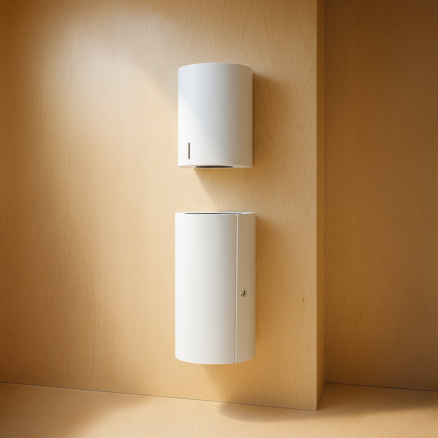
Dan Dryer — the Danish manufacturer behind the BJÖRK, LOKI, and Stainless Design commercial bathware lines — is available in the full RAL Classic colour palette, in either matte or gloss finish, on every powder-coated piece in the range. RAL Classic includes hundreds of named colours, which means a hand dryer, soap dispenser, paper towel dispenser, baby changing station, or waste bin can be specified to match a brand palette, an existing tile, or a specific architectural reference. Particularly relevant for hotels, restaurants, healthcare, and any commercial project where bathware is part of the design language rather than an afterthought.
Browse the Dan Dryer Collection
Bringing it together
The discipline of using colour well in hardware is the same as the discipline of using colour well anywhere — restraint, context, and considered placement. For a single accent, pick the room, pick the moment within that room, and let everything around it stay quiet enough that the colour reads as deliberate. For a full system, choose a manufacturer whose colour range supports the project's palette and let the consistency itself become the design language.
One bright thing in a calm space carries more impact than five bright things competing for attention. The same principle applies to a system, in reverse: a coordinated colourway across an entire bathroom is striking precisely because every element belongs to it.
Leave a comment